
2026/2027 Christmas Decorative Nesting Boxes with Lids: Essential Print & Design Trends for Retail Buyers-The New Paradigm of Holiday Gift Packaging
The retail environment for holiday decorations is undergoing a quiet but powerful evolution. Modern consumers no longer view gift boxes as mere temporary vessels to be discarded immediately after Christmas morning. Instead, they expect high-end packaging that serves a dual purpose: a beautiful gift container and a reusable home decor accent that retains its structure year after year.
For corporate purchasing agents, large-scale retail buyers, and e-commerce shop owners, staying ahead of this design curve is crucial for maintaining healthy margins. The market is increasingly rejecting cheap, mass-produced lookalikes in favor of thoughtful craftsmanship. Selecting the right aesthetic themes for your holiday inventory will make the difference between premium shelf appeal and deep post-season clearance markdowns.
In this comprehensive B2B sourcing guide, we analyze the defining print, color, and texture trends shaping Christmas decorative nesting boxes with lids for the upcoming 2026/2027 holiday retail cycle.
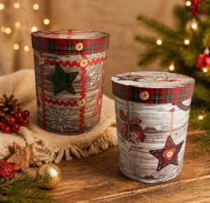
Trend 1. The Revival of Vintage Elegance: Nostalgic & Botanical Prints
As consumers seek comfort and authenticity in an increasingly digital world, nostalgic design has emerged as a major driving force in retail. For the 2026/2027 winter season, this nostalgic wave is manifesting through highly detailed, hand-drawn heritage artwork that honors the timeless traditions of the holiday season.
"Retro and heritage packaging prints do not merely look old; they evoke a sense of warmth, safety, and emotional continuity that modern digital graphics simply cannot replicate."
Victorian-Era Illustrations & Classic Storytelling
The traditional, overly bright cartoon caricatures of Santa Claus are rapidly\ losing traction in premium retail segments. Instead, designers are looking backward, drawing inspiration from late 19th-century printmaking, copperplate engravings, and classic European Christmas lore.
- Intricate Line Work: Holiday nesting boxes are showcasing fine-line
cross-hatching, copperplate etching styles, and sepia-toned washes. - Nostalgic Santa Claus: The "Father Christmas" imagery of 2026/2027 is
depicted in deeper burgundy or forest green robes, holding hand-carved
wooden toys, reflecting old-world European charm. - Atmospheric Storytelling: Box lids frequently feature complete scenic
narratives, such as quiet, snow-dusted Victorian villages, vintage
horse-drawn carriages, and soft candle-lit windows.
These intricate designs turn a standard nesting box into a collectible keepsake. Consumers often stack these boxes under the tree or on mantlepieces as stand-alone decorations, justifying a higher price point at retail.
Winter Botanicals: Holly, Ivy, and Mistletoe Fine Art
Beyond figurative nostalgic characters, fine-art botanical prints are experiencing a massive surge in demand. This trend shifts away from simplified, geometric vector shapes toward botanical accuracy and artistic realism.
Rather than using repetitive patterns, high-end nesting box sets are utilizing asymmetrical, flowing compositions of winter foliage. Think delicate watercolor washes of eucalyptus leaves, highly detailed cedar boughs, dried orange slices, and realistic pinecones with snow dusting.
This aesthetic leans heavily into a sophisticated, academic look that pairs beautifully with heavy, textured paperboards. It bridges the gap between traditional holiday cheer and year-round nature appreciation, making the boxes versatile enough to be used long after December has passed.
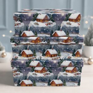
Trend 2. "Quiet Luxury" Aesthetics: Neutral Tones & Minimalist Finishing
The global consumer movement toward "Quiet Luxury"—characterized by understatement, premium materials, and minimal branding—has firmly integrated into the packaging industry. Holiday gift packaging is transitioning from loud, flashy designs to calm, confident statements.
Earthy Color Palettes: Sand, Sage Green, and Oatmeal
According to the latest [Pantone Fashion Color Trend Report (https://www.pantone.com), the leading colors
for the autumn and winter seasons focus on grounded, familiar earth tones that
convey balance and authenticity. The traditional stark red and emerald green are
stepping aside to make room for complex, natural hues.
| Trend Color | HEX Vibe | Ideal Design Application |
|---|---|---|
| Sage Green | Muted, organic, herbal | Primary box base paired with botanical illustrations |
| Oatmeal / Cloud Dancer | Soft, warm off-white | Minimalist background to make gold foil elements pop |
| Cocoa Powder | Deep, comforting earthy brown | Contrast accents on box lids and interior lining |
| Transformative Teal | Rich, deep blue-green | High-contrast premium sets for luxury retailers |
These colors offer a refreshing break from the visual noise of the holiday
shopping season. When displayed together as a nested set, these muted tones
create a harmonious, spa-like color gradient that appeals strongly to modern
millennial and Gen Z demographics.
Subtle Metallic Accent: Matte Gold and Champagne Foil Stamping
To prevent minimalist neutral colors from looking plain, designers are utilizing
sophisticated metallic finishes that catch the light elegantly.
"In 2026/2027, the rule of thumb for metallic embellishments is restraint: metallic elements should whisper luxury, not scream for attention."
Instead of high-gloss, mirror-like gold foil that can easily look cheap, premium
manufacturers are turning to matte foil stamping. Matte gold, pale champagne
gold, and brushed copper foils are being applied sparingly.
These metallic accents are used to highlight thin, delicate outlines of pine
leaves, the veins of a leaf, or elegant, serif brand typography on the lid. The
goal is to create a dynamic finish where the metallic elements are only fully
appreciated when the consumer tilts the box in their hands.
To explore how these sophisticated textures can be combined with diverse base
materials to maximize shelf impact, check out our companion guide: [Internal
Link: Holiday Box Surface Print Techniques Guide].
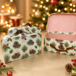
Trend 3. Eco-Friendly Printing: Sustainable Textures & Safe Inks
Sustainability has evolved from a generic marketing buzzword into an absolute
regulatory and consumer mandate. Modern retail buyers are under immense pressure
to source products that provide clear, undeniable proof of their environmental
credentials.
Soy-Based Inks on Recycled and Kraft Paperboards
Traditional petroleum-based inks are rapidly being phased out by
forward-thinking gift packaging manufacturers. Instead, high-end nesting boxes
are printed using soy-based and vegetable-based inks.
According to research and testing standards upheld by organizations like the
American Soybean Association, soy inks offer several distinct advantages for
holiday packaging:
- Vibrant Yet Natural Depth: Soy inks possess a higher clarity than petroleum
inks, allowing pigment colors to look incredibly rich without requiring
glossy synthetic coatings. - Ultra-Matte Compatibility: They perform exceptionally well on uncoated,
recycled gray board and natural kraft papers, sinking into the fibers to
create a beautifully soft, matte finish. - Easier De-Inking: During the recycling process, soy inks are much easier to
strip from paper fibers, drastically reducing the environmental footprint of
the packaging's end-of-life cycle.
When paired with natural kraft papers, soy inks allow the raw, rustic texture of
the paperboard to shine through, providing an organic tactile experience that
consumers associate with genuine sustainability.
Embossing & Debossing: Adding Texture Over Heavy Ink
One of the cleanest ways to achieve an eco-friendly design is to replace heavy
ink coverage with tactile paper manipulation. Blind embossing (raising the paper
surface) and debossing (pressing the design into the paper) are leading this
shift.
By pressing intricate patterns directly into the thick gray board of the nesting
box, manufacturers create deep shadow lines and a rich texture without using a
single drop of ink. Imagine a nesting box lid where a thick border of winter
holly is entirely debossed into the paperboard, leaving a deep, tactile frame
that frames a minimal gold-foiled central text.
This method not only elevates the structural premium feel of the box, but it
also satisfies the strict sourcing guidelines of eco-conscious global
conglomerates.
Furthermore, statistics compiled by the Forest Stewardship Council (FSC)
demonstrate that products displaying verified sustainable forestry labels enjoy
a marked increase in consumer trust and purchase intent on crowded retail
shelves.
Case Study: How Switching to "Quiet Luxury" Foil Prints Increased an Amazon Store's ROI by 45%
To illustrate the real-world commercial value of these aesthetic shifts, let us
examine a project we executed for an established e-commerce retailer selling on
Amazon UK and Germany.
For three consecutive years, this retailer sold traditional holiday nesting
boxes featuring bright, high-gloss red and green prints of cartoon snowmen and
reindeers. However, by the close of the 2024 season, their profit margins had
shrunk by 18% due to fierce price competition from low-cost factories executing
identical designs.
Prior to the 2025 holiday buying season, we implemented a complete aesthetic
pivot for their brand:
- The Design Overhaul: We scrapped the high-gloss cartoon prints. Instead, we
sourced thick, premium 1500gsm rigid paperboard wrapped in uncoated,
FSC-certified sand-colored art paper. - The Print Upgrades: The boxes were printed with sage green soy inks
depicting delicate, vintage botanical pine branches. We added micro-stamped
champagne matte gold foil to highlight the pinecones. - The Retail Strategy: Rather than competing on price, the brand repositioned
itself as a premium "gift-and-decor-in-one" keepsake solution. - The Commercial Results: Despite keeping the box dimensions and structural
paperboard weights identical to the previous years, the brand was able to
raise its retail price point by 35%. The entire inventory sold out by the
third week of November, resulting in a 45% increase in seasonal ROI and a
near-zero rate of post-holiday returns.
Sourcing Checklist: Ensuring Print Quality and Color Accuracy for Retail Display
When purchasing Christmas decorative nesting boxes with lids in bulk, executing
high-end print designs requires strict quality control measures. Because nesting
box sets contain multiple sizes that fit inside one another, any minor flaw in
print alignment or color variation is immediately noticeable.
Consistent Color Matching Across Nested Box Sizes
Because the large, medium, and small boxes in a nesting set are often printed on
different sheets or in separate print runs, maintaining perfect color uniformity
is a common industry challenge.
- Specify Pantone Solid Coated/Uncoated Standards: Never allow your
manufacturing partner to match colors based on a digital PDF mock-up. Always
specify exact Pantone Matching System (PMS) numbers. - Insist on Color Spectrophotometer Checks: Your supplier should measure color
density during production using a spectrophotometer, ensuring the color
variance (Delta E) remains strictly under 2.0. - Check Color Under Standardized Light Boxes: Ensure your quality control
inspector evaluates the finished nesting sets under D65 standard daylight
lamps to prevent metamerism (where colors match under factory lights but
clash under retail store lights).
Scratch-Resistant Coating: Protecting the Print on Retail Shelves
Matte paper finishes and dark ink saturation (such as deep forest green or
charcoal black) are highly susceptible to scuffing and scratch marks during
transit, assembly, and customer handling on retail shelves.
"A single white scuff mark on a premium dark green nesting box can destroy its luxury appeal instantly, rendering it unsellable at full retail price."
- Anti-Scratch Matte Lamination: If your boxes use coated art paper wraps,
always request an anti-scratch matte lamination film. This specialized film
creates a protective barrier that resists fingernail scratches and friction
scuffs. - Water-Based Matte Varnish: For raw, uncoated, or kraft paper options where
plastic film is avoided for eco-friendly reasons, request a high-performance
water-based matte varnish. This seals the ink pigments into the paper fibers
without adding plastic or changing the natural touch of the paper.
For a comprehensive breakdown of technical tolerances, ink density standards,
and paperboard moisture testing, you can download our internal checklist:
[Internal Link: Printing & Packaging Quality Control Checklist].
People Also Ask: Finding High-End Christmas Printed Nesting Boxes
Q1: What are the most popular background colors for premium nesting box sets in 2026/2027?
A1: The top background colors are muted neutrals, including warm sand, oatmeal
(off-white), soft sage green, and rich, deep cocoa brown. These tones have
replaced the traditional, high-saturation bright reds and greens in the high-end
gift market.
Q2: How do I ensure that foil stamping on recycled paperboard does not peel or crack?
A2: Always request a pre-production sample to test the adhesive properties of
the foil on your chosen paperboard texture. Reputable factories must match the
specific paper grain with the correct foil grade, heat setting, and dwell time
during the stamping process.
Q3: Why is FSC-certified paperboard important for holiday nesting box procurement?
A3: Large Western retail chains (such as Target, Marks & Spencer, and Costco)
have strict environmental sourcing compliance rules. Sourcing FSC-certified
nesting boxes proves the wood fiber comes from responsibly managed forests,
allowing you to bypass strict retail gatekeepers easily.
Q4: Should I choose coated or uncoated paper wrapping for vintage botanical prints?
A4: Uncoated, high-quality art paper is highly recommended for vintage botanical
and nostalgic designs. The natural texture of uncoated paper diffuses light
beautifully, adding a rustic, antique look that coated paper cannot replicate.
About the Author
Grace Zhao is the Lead Content Director and Chief Packaging Designer with
over 10 years of hands-on experience in global print manufacturing and gift
packaging supply chains. Having designed and engineered holiday catalog programs
for elite boutique brands across the United States and Western Europe, she
specializes in translating emerging design trends into highly manufacturable,
retail-ready packaging solutions. Her passion lies in blending eco-friendly ink
innovations with classic tactile print structures to help brands maximize their
perceived value on the shelf.