The Semiotics of Abundance: Deconstructing the Strategic Architecture of American Holiday & Promotional Gift Packaging
In the high-velocity landscape of North American retail and e-commerce, the holiday season represents a critical commercial arena. For cross-border brand owners, supermarket gift buyers, and supply chain managers, packaging is far more than a protective container; it is a vital commercial asset.
A profound aesthetic divide exists across the Atlantic: while European design paradigms frequently gravitate toward hyper-minimalism, delicate micro-packaging, and complex structural configurations, these configurations often fail in the United States [4]. To succeed in the American mass market, packaging must align with distinct consumer expectations of volume, practicality, and festive warmth.
This analysis deconstructs the structural, material, and visual semiotics of American holiday packaging. It outlines how to engineer promotional gift sets that drive conversion, preserve margin, and survive the rigors of transpacific logistics.
Section 1: The Color Semiotics of Festivity—Saturating the American Purchase Funnel
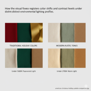
Color is the first sensory signal to reach the consumer’s eye. It shapes subconscious expectations long before the structural details or typography are processed. In the context of American holiday merchandising, color selection must navigate between two distinct psychological profiles: traditional retail saturation and modern rustic warmth.
| Strategic Dimension | Traditional Retail Saturation | Modern Rustic Warmth |
|---|---|---|
| Primary Palette | True Red (#D32F2F), True Green (#2E7D32), Bright Gold (#FFD700), Pure White |
Cream White (#FDFBF7), Sage Green (#8FBC8F), Warm Kraft / Jute |
| Psychological Trigger | High-contrast excitement, physiological stimulation, impulse-buy urgency | Sophisticated organic comfort, artisanal intimacy, decompression |
| Primary Channel | Mass-market retail shelves (e.g., Walmart, Costco, Target) | DTC e-commerce, premium boutique unboxing, lifestyle brands |
Traditional Retail Saturation: High-Contrast Wavelengths
Traditional American holiday design relies on high-saturation, high-contrast combinations: True Red (#D32F2F), True Green (#2E7D32), Bright Gold (#FFD700), and Pure White. These colors are not merely festive clichés; they serve as critical visual disruptors on crowded retail shelves.
- True Red stimulates the amygdala, elevating the heart rate and cultivating a sense of commercial urgency that supports impulse purchases.
- True Green acts as a grounding balance, signaling domestic security and nostalgic comfort.
- Bright Gold introduces high-frequency visual interest, which the human eye associates with premium value even in peripheral vision.
Modern Rustic Warmth: Soft Tones for DTC Channels
For direct-to-consumer (DTC) e-commerce and premium lifestyle brands, the palette shifts toward a modern, rustic aesthetic. Cream White (#FDFBF7) replaces clinical pure white, removing sterile undertones and substituting them with soft, welcoming warmth.
Sage Green (#8FBC8F) tones down the commercial energy of traditional green, offering a sophisticated, heritage-driven tranquility. Earthtony warm kraft and jute elements ground the design, communicating authenticity, sustainability, and craftsmanship.
Defensive Contrast: Avoiding Gaudiness and Sterility
When deploying these color strategies, designers must avoid two common pitfalls:
- The Cheapness Trap: Low-tier packaging often relies on unlaminated, low-grammage paperboard printed with raw, uncalibrated inks. This results in synthetic-looking neon tones that signal low product quality. To prevent this, traditional saturated tones must be balanced with matte finishes and deep, rich color calibration that signals material weight.
- The Sterile European Trap: Conversely, attempting to stand out by using "quiet luxury" palettes—such as slate gray, cold taupe, or ultra-muted charcoal—often misfires during the holidays. In the American market, these colors can read as sterile, emotionally detached, and uninviting. Holiday shopping in the US is driven by shared warmth and generosity; packaging that rejects these themes risk being overlooked by consumers seeking festive connection.
Environmental Variables: Shelf Lighting vs. Residential Warmth
Packaging must perform consistently across diverse environments:
- Supermarket Fluorescent Lighting (4000K–5000K): Under these cool, aggressive light sources, low-contrast palettes often appear washed out and flat. High-contrast traditional red and gold combinations maintain their edge, cutting through the overhead glare to capture passing shoppers.
- Residential Warm Lighting (2700K): Once the product is brought home, the warm cream whites, sage greens, and rustic textures soften under cozy incandescent light. This shift supports a satisfying unboxing experience, reinforcing the consumer's perception of quality. From a colorimetric perspective, maintaining strict spectrophotometric control—limiting deviation to ΔE∗ab < 1.5 under standard illuminant D65 as specified by ISO 12647-2 for graphic technology—is critical to preventing off-hue shifts under changing retail luminaires.
Section 2: Structural Rationalism—Why Volumetric Generosity Trumps Intricate Artistry
In the American consumer market, spatial volume serves as a primary heuristic for value. The physical scale of a gift box acts as a direct proxy for the worth of its contents. This reality shapes the structural engineering of successful holiday packaging.
| Mechanical Parameter | Standard 90° Orthogonal Box (e.g., Lid-and-Base) | Complex Irregular Geometric Box |
|---|---|---|
| Load Path Distribution | Uniformly distributed along the vertical axes of 4 structurally rigid corners | Unevenly distributed; concentrated stress at non-orthogonal joints |
| Risk of Buckling | Extremely low under static stacking limits | Extremely high; prone to premature wall collapse and corner split |
| BCT Efficiency | Optimized (100% capacity per material weight) | Highly degraded; requires excessive material to offset weak joints |
Dominant Structural Typologies
The American promotional market is dominated by three primary configurations, each engineered for functional clarity:
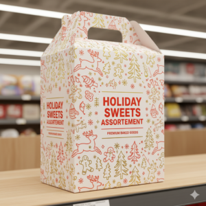
- Lid-and-Base Boxes (天地盖): The classic rigid two-piece configuration. It is structurally robust, provides immediate unboxing clarity, and offers an expansive canvas for brand graphics.
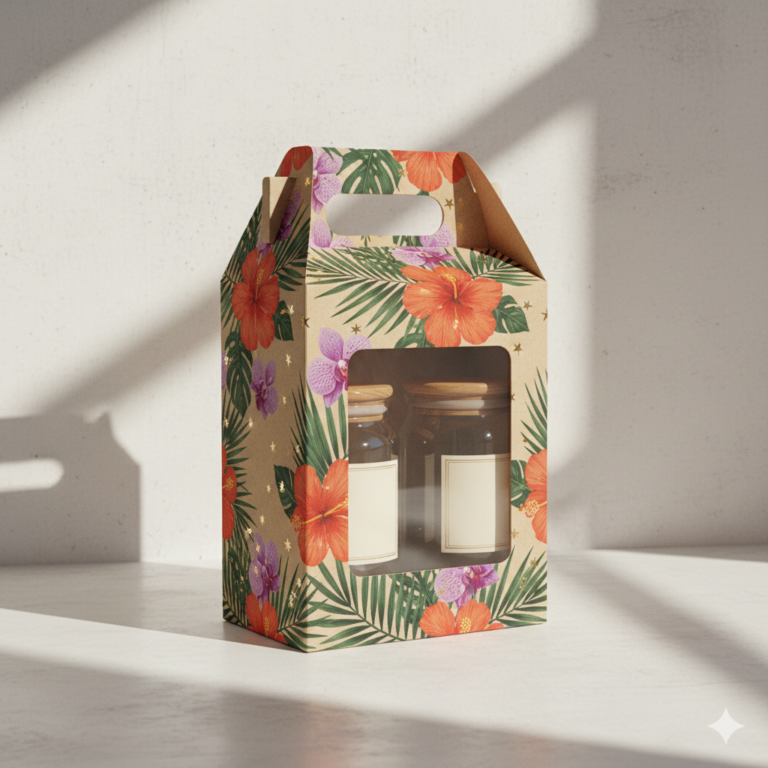
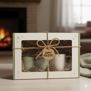
- Window Boxes (开窗盒): Combining a structured paperboard frame with a clear PET/PVC window. This design satisfies the consumer’s desire for immediate product verification, reducing purchase hesitation by showcasing the physical assets inside.
- Handle Boxes (手提盒 / 飞机提手盒): Highly practical configurations that eliminate the need for secondary plastic shopping bags. This design simplifies the consumer's journey from the retail shelf to their vehicle.
To achieve this level of high-volume stability, designers must transition from fragile custom mockups to highly stackable structural box styles that guarantee dimensional integrity throughout the transpacific logistics chain.
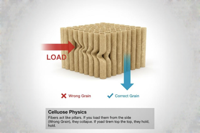
The Physics of Stackability: McKee's Formula
To engineer high-volume, cost-effective packaging, structural engineers must design with vertical load paths in mind. Under transit conditions, the compressive strength of a standard rectangular box can be calculated using McKee's Formula:
$$BCT = 5.87 \cdot ECT \cdot \sqrt{P \cdot t}$$
Where:
- BCT is the Box Compression Test value (ultimate vertical load capacity).
- ECT is the Edge Crush Test value of the board.
- P is the box perimeter ($2 \times \text{length} + 2 \times \text{width}$).
- t is the structural paperboard thickness.
Standard 90-degree orthogonal configurations maximize this mathematical relationship. The vertical load is carried entirely by the corners of the box. Any deviation toward irregular, non-rectangular, or asymmetric profiles compromises the perimeter constant ($P$), distributing the stress unevenly and causing premature structural buckling under static loads.
Defensive Contrast: Democratic Abundance vs. Intricate Fragility
European luxury packaging often favors complex, multi-layered folding structures with small footprints. While elegant in low-volume, high-touch boutique settings, this approach often fails in high-throughput American retail environments for several reasons:
- The "Stinginess" Penalty: Small, highly intricate boxes are often perceived by mass-market American consumers as offering low value for the money. A larger, robust lid-and-base box projects a sense of generosity and utility.
- The Operational Bottleneck: Complex, multi-folded designs require slow, manual assembly on the factory floor. In contrast, standardized box styles are highly compatible with automated assembly lines, reducing production lead times and labor costs.
- The Retail Disruption Risk: Irregular, non-orthogonal shapes cannot be neatly stacked. They present significant challenges for standard retail display units, such as endcaps and Point-of-Purchase (POP) displays, often leading to rejected placements by supermarket buyers.
Environmental Variables: Transit Stress and Shelf Stacking
Packaging must withstand severe mechanical demands before it ever reaches the retail floor. Standard testing profiles, such as those outlined by the ASTM D642 standard for determining compressive resistance of shipping containers, demonstrate that standard box shapes preserve corner rigidity far more effectively than irregular contours. Under transpacific transit pressures, any reduction in static compression performance leads to compromised structural integrity and increased damage rates.
Section 3: Material Pragmatism—Balancing Sensory Weight with Industrial Scalability
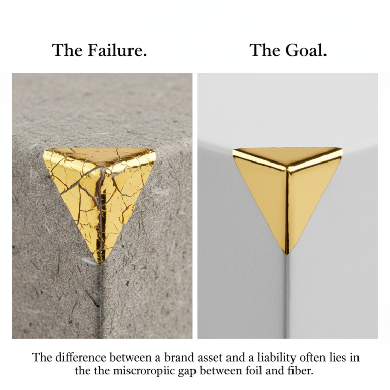
A common point of failure for overseas designers is selecting materials that look excellent on a physical desktop but fail under mass-production conditions or cross-border shipping. Sustainable profitability requires a careful balance between tactile quality and industrial performance.
| Material Substrate | Tensile & Tear Strength | Moisture Resistance (Cobb Value) | High-Speed Printability | Transpacific Unit Economics |
|---|---|---|---|---|
| Premium SBS Board | High (Optimal structural stiffness) | High (With hydrophobic lamination) | Excellent (Consistent ink transfer) | Highly Favorable (High ROI at scale) |
| Specialty Textured Paper | Low to Moderate (Prone to fiber tearing) | Low (Highly hydrophilic; moisture-absorbing) | Variable (Inconsistent absorption & foil adhesion) | Cost-Prohibitive (Erodes promotional margins) |
Substrates: Premium SBS Board vs. Specialty Textured Papers
High-volume promotional gift sets require high-grade Solid Bleached Sulfate (SBS) paperboard or double-coated art paper. These materials provide the high tensile and tear strength required to withstand high-speed automated folding and packing lines.
In contrast, expensive textured specialty papers present several manufacturing challenges:
- They are highly hydrophilic, absorbing moisture and losing structural stiffness during humid transpacific transit. Standard Cobb testing values (which measure the water absorption rate of paper over a set duration) show that untreated specialty papers absorb significant moisture, whereas laminated paperboards maintain a Cobb value near zero.
- Their uneven surfaces can lead to inconsistent ink absorption and foil adhesion, increasing reject rates during high-speed printing runs.
- Their premium cost-per-sheet can quickly erode margins on promotional gift sets.
Decorative Finish Architecture (The Micro-tactile Layering Stack)
To achieve premium haptics on an industrial budget, engineers must layered post-press finishes logically:
- Top Decorative Layer: Localized Spot UV (
High Gloss) / Hot Foil Stamping (Specular Reflection) - Barrier & Haptic Layer: Matte Lamination Film (
Soft Touch, Anti-Glare, Hydrophobic) - Print Layer: Offset CMYK / Pantone Ink (
High-Fidelity Chroma) - Core Substrate: Standard Solid Bleached Sulfate (SBS) Board (
Structural Foundation)
This strategy mimics the tactile luxury of textured papers at a fraction of the cost, ensuring high margin preservation. By leveraging efficient surface finishing and offset printing techniques, manufacturers can apply precise Spot UV coatings and foil stamping to standard SBS substrates.
Applying a high-quality matte lamination film over printed SBS board creates a smooth, glare-free finish that eliminates the synthetic feel of basic paperboard. When layered with localized Spot UV and hot foil stamping, the design plays on the contrast between the light-absorbing matte background and the highly reflective, raised elements. This approach creates a premium, multi-sensory unboxing experience while utilizing highly economical and recyclable base materials.
Environmental Variables: Ocean Humidity and Retail Wear
Packaging materials must remain stable across changing environments:
- Relative Humidity (RH) Fluctuations: Ocean shipping containers crossing the Pacific often experience relative humidity levels exceeding 80%, combined with significant temperature swings. Unlaminated specialty papers absorb this moisture, which can lead to warping, adhesive failure, and mold. A laminated SBS board acts as a protective barrier, maintaining its structural integrity and protecting the contents inside.
- Retail Contact Resistance: On busy retail shelves, packaging is handled by dozens of shoppers. Unprotected papers easily collect oil, fingerprints, and scuffs. Matte and glossy lamination films resist these markings, ensuring the package remains clean and presentable throughout its shelf life.
Section 4: The Typographic & Illustrative Semiotics of Holiday Nostalgia
The graphic layout of American holiday packaging must balance nostalgic emotional appeal with clear, efficient information design.
| Design Element | American Saturated Abundance (Recommended) | Sterile European (Not Recommended) |
|---|---|---|
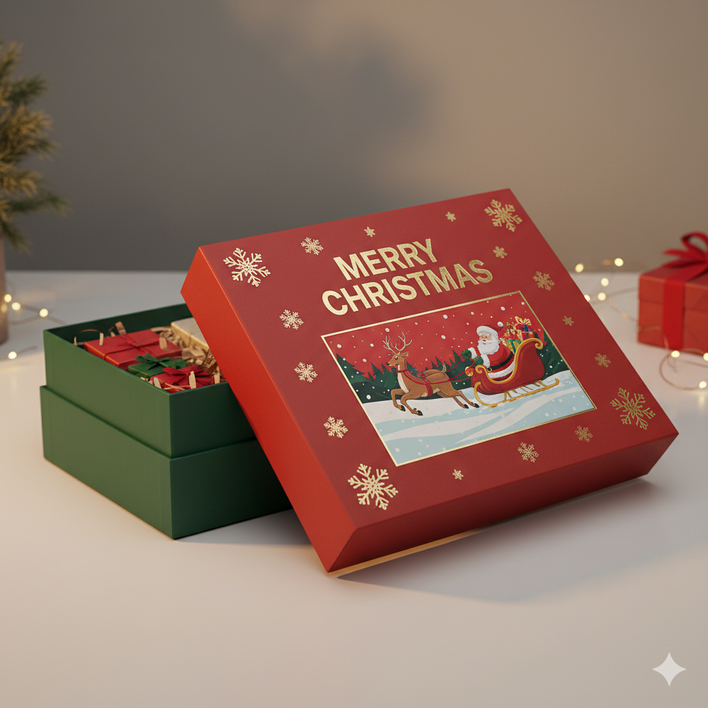
| Primary Typographic Focus | Bold, high-visibility sans-serif titles (e.g., "MERRY CHRISTMAS") | Diminutive, low-contrast sans-serif or ultra-thin serif brand names |
| Negative Space Policy | Dense, rich, and informative layout filled with festive elements | Vast expanses of clinical, empty white/slate-gray space |
| Illustrative Approach | Universally recognizable nostalgic motifs (Santa, Reindeer) | Hyper-minimalist abstract patterns or blank solid colors |
| Consumer Response | Instant value recognition, inclusive warmth, lowered purchasing friction | Visual anxiety, perceived stinginess, emotional alienation |
Nostalgic Iconography vs. Avant-Garde Minimalism
To capture the attention of the mass American consumer, visual design should embrace classic holiday motifs: Santa Claus, reindeer, gingerbread houses, and vintage sleighs. These symbols trigger warm, nostalgic memories, bypassing consumer skepticism and creating an immediate emotional connection.
These traditional elements can also be successfully combined with rustic accents:
- Jute Rope and Burlap Textures: These details add a comforting, handcrafted quality to the packaging.
- Clean Geometric Linework: Modern geometric details help ground traditional motifs, ensuring the overall design feels fresh and contemporary rather than outdated.
Typography: Bold, Clean Sans-Serif Fonts
Holiday shopping environments are highly stimulating and fast-paced. Packaging typography must deliver critical product information instantly. Using bold, clean sans-serif fonts (such as Montserrat, Futura, or heavy Helvetica variants) ensures maximum readability from several feet away. Essential product details—such as "5-Piece Bath & Body Set" or "Gourmet Holiday Selection"—should be presented with absolute clarity, avoiding overly complex script fonts or decorative serifs that require extra effort to read.
Defensive Contrast: Inclusive Warmth vs. Exclusive Anxiety
Many premium European brands rely on minimalist layouts characterized by tiny serif typography and vast expanses of empty white space. While this approach effectively communicates exclusivity in luxury boutiques, it can create a sense of emotional distance in a holiday retail environment.
American holiday shopping is fundamentally centered on warmth, family, and shared appreciation. An ultra-minimalist, stark white box can feel cold and uninviting, failing to capture the festive spirit. In contrast, a warm, beautifully illustrated design communicates generosity, comfort, and celebration. It positions the product as an inviting, ready-to-share gift, easing the buyer's purchasing decision.
Environmental Variables: The 1.2-Second Shelf Scan
In busy retail environments, a consumer walking down a supermarket aisle at approximately 1.5 meters per second will glance at a product for an average of 1.2 seconds. Packaging with small, hard-to-read typography or vague branding fails this critical scan test. A well-structured design featuring bold, high-contrast typography and classic holiday imagery communicates value instantly, capturing attention and driving conversion in that vital window.

Section 5: Strategic Supply Chain Integration for Global Product Managers
Successfully executing a holiday packaging strategy requires close collaboration between design concept and manufacturing reality. For cross-border product managers, this means selecting partners capable of scaling production without sacrificing quality.
Mitigating Manufacturing Bottlenecks
The third and fourth quarters are the busiest periods for packaging manufacturing. Complex, non-standard structural designs can quickly lead to production delays, rising material costs, and missed shipping windows. By prioritizing standardized, flat-packing, and easily assembled box structures, brand owners can streamline production, reduce manual labor requirements, and secure stable delivery times during peak seasons.
Maintaining Quality Consistency at Scale
Partnering with a mature manufacturer capable of delivering commercial-grade custom packaging solutions by LJX-Pack ensures that high-volume orders are executed with absolute dimensional and chromatic consistency, guaranteeing a frictionless transition from the factory floor to North American retail shelves. This professional integration allows global brands to deploy holiday packaging that is visually striking, structurally dependable, and optimized for maximum profitability.
Conclusion: The Strategic Blueprint for Holiday Packaging Success
To win the competitive North American holiday market, cross-border brands must reject fragile, overly delicate design trends and embrace packaging that balances festive warmth with operational efficiency. By pairing bold, nostalgic visual elements with structurally sound, easy-to-stack configurations, and utilizing cost-effective substrates enhanced with high-quality finishes, brands can capture consumer attention and protect their margins.
The most successful holiday packaging is engineered to perform seamlessly across every stage of the journey—from high-speed assembly and long-distance ocean freight to the retail shelf and the final unboxing experience.
Frequently Asked Questions (FAQ)
-
Q1: How can cross-border product managers optimize holiday gift box stacking strength (BCT) for ocean shipping?
- A: By adopting 90-degree orthogonal, highly stackable structural box styles (such as rigid lid-and-base configurations) rather than complex, irregular geometric designs, engineers can distribute static vertical load forces uniformly along the four corners. According to McKee's formula (BCT = 5.87 \cdot ECT \cdot \sqrt{P \cdot t}), maintaining rigid corner profiles minimizes wall buckling and corner splitting under heavy pallet loading, ensuring zero structural deformation during high-pressure transpacific container transit.
-
Q2: What is a cost-effective alternative to expensive specialty textured papers for mass promotional packaging?
- A: A highly cost-effective alternative is to use standard SBS (Solid Bleached Sulfate) paperboard or coated art paper finished with a hydrophobic matte lamination film. By leveraging efficient surface finishing and offset printing techniques—such as localized Spot UV and hot foil stamping over a light-absorbing matte background—manufacturers can create a premium, high-contrast haptic unboxing experience. This strategy successfully mimics the tactile luxury of textured papers while significantly reducing unit costs and protecting commercial margins.
-
Q3: How do you prevent custom paper gift sets from warping and losing rigidity during high-humidity transpacific transit?
- A: To prevent moisture-induced warping, packaging engineers must avoid unlaminated or highly hydrophilic specialty papers that exhibit high water absorption (Cobb) values. Instead, specify premium Solid Bleached Sulfate (SBS) cardstock sealed with a hydrophobic matte or glossy lamination film. This polymeric layer acts as a moisture-vapor barrier, keeping the package's Cobb values near zero and maintaining structural rigidity even when exposed to relative humidity levels exceeding 80% inside ocean shipping containers.
-
Q4: Why does bold, traditional holiday packaging outperform minimalist designs in US mass-market retail sales?
- A: Bold, high-contrast traditional palettes (vibrant red, green, and gold) combined with universally recognized nostalgic holiday iconography leverage the cognitive fluency bias. In fast-paced retail settings where shoppers scan shelves in 1.2 seconds, dense and informative layouts provide immediate value recognition and inclusive warmth. This frictionless layout reduces purchasing anxiety, yielding significantly higher impulse-buy conversion rates in major US supermarkets than cold, sterile, or hyper-minimalist European-style boutique packaging.
-
Q5: What is the best strategy to scale custom holiday packaging production without bottlenecks during peak season?
- A: To scale production for the Q3-Q4 seasonal surge, product managers must design packaging for automated assembly by avoiding complex, manual folding mechanisms. Utilizing standardized box configurations (such as flat-packing lid-and-base or handle boxes) allows for seamless high-speed machine runs. Partnering with a manufacturer capable of delivering commercial-grade custom packaging solutions by LJX-Pack ensures absolute dimensional consistency, rapid prototyping, and stable delivery timelines under strict transpacific logistics schedules.