The Semiotics of Restraint: Why British Holiday Packaging Demands an "Heirloom" Aesthetic
In the competitive landscape of seasonal retail, a subtle but fatal error is frequently made by brands attempting to capture the British market: the conflation of "festive" with "loud."
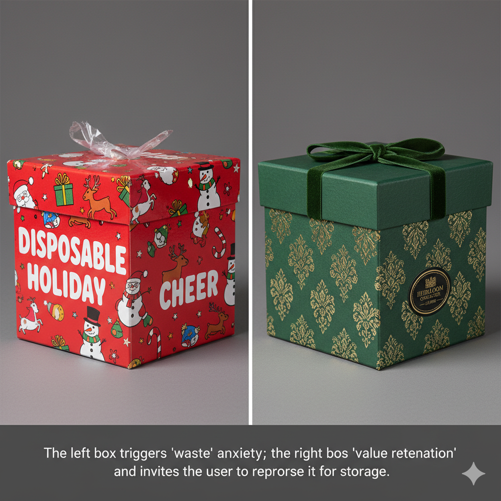
As a visual semiotician, I observe a recurring failure in holiday packaging design: the imposition of American-style "Kitsch" onto British sensibilities. The neon-bright reds, the exuberant cartoon motifs, and the frantic, maximalist graphic layouts do not signal joy to the refined British consumer; they signal transience, disposability, and, worst of all, low value.
The British aesthetic, particularly regarding high-end holiday gifting, is rooted in a cultural preference for "understated sophistication." It values the concept of the heirloom—the idea that an object has a life cycle that extends far beyond the moment the bow is untied. To win in this market, we must pivot from the ephemeral nature of "festive packaging" toward the permanent utility of "storage design."
The Semiotic Trap: Why Cartoons Fail the British Consumer
The core mistake lies in the misunderstanding of "Holiday Spirit" as a visual trope. In many North American markets, holiday packaging is expected to be loud—a visual advertisement for the joy within. However, in the UK, luxury is defined by reticence.
When a brand covers a box in cartoon reindeer or bright, artificial, primary colors, it signals to the British consumer that the product is a "disposable artifact." It is something meant to be torn open and discarded. This triggers a psychological rejection. The box ceases to be a container of value and becomes a container of waste.
To reverse this, we must employ the semiotics of heritage. We must design packaging that feels like it could have been pulled from a Victorian study or a Regency-era manor. This does not mean it must look "old"; it means it must look considered.

The Strategic Pivot: The Box as Furniture, Not Trash
The ultimate goal of your packaging strategy should be the "Post-Festive Utility." If a customer receives a gift, they should feel a pang of guilt at the thought of throwing the box away. This is achieved through structural integrity.
When we look at Custom Rigid Box Solutions, we are not looking at simple cardboard; we are looking at the foundational architecture of the gifting experience. A rigid box, by virtue of its density and structural memory, suggests durability. It tells the user: "I am built to hold things of value—jewellery, photographs, letters, or keepsakes—long after the Christmas tree has been taken down."
By utilizing high-density board and precision-engineered closures, you move the product from the realm of "wrapping" to the realm of "furniture." In a UK context, this is a powerful psychological lever. It aligns the brand with the values of sustainability and permanence, which are currently paramount in the minds of British B2B buyers and end-consumers alike.
The Palette of Authority: Redefining "Festive"
The British holiday palette is not neon. It is earth-bound, grounded, and rooted in the architecture of the British landscape. We are talking about the muted brilliance of oxblood, the deep, shadowed tones of forest pine, the warmth of navy, and the subtle glint of champagne or antique gold.
When you use a "muted" palette, you are using color to suggest history. Bright red is ephemeral; oxblood is timeless. Bright green is artificial; forest pine is eternal.
The application of these colors must also be tactical. Avoid the "full-bleed" print which often leads to poor edge definition on the corners of the box. Instead, use the box color as the base, and use the branding elements as accents. This creates a visual "breathing room" or what we call "negative space strategy." This space communicates that you are not desperate for the consumer's attention—you are confident in your value.
The Tactile Narrative: Crafting the Gentleman’s Standard
A true "Gentleman’s Gift Box" is defined by how it feels in the hand. Visuals are only 50% of the sensory experience; the rest is haptic.
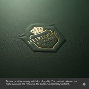
This is where Precision Surface Finishing and Craftsmanship become the deciding factor in the purchase decision. A smooth, flat, digital print feels like nothing. It is anonymous. However, an embossed pattern—perhaps a subtle tartan or a damask scroll—creates a topographic surface that the user wants to touch.
Consider the "Cross-Ribbon" aesthetic. This is a classic semiotic anchor. It does not need to be a physical ribbon that tangles or rips; it can be a printed or foiled cross-pattern that mimics the idea of a parcel while maintaining a clean, industrial surface. It is a nod to the past, modernized for contemporary storage needs.
When you apply hot stamping (foil) onto a matte-laminated rigid box, you create a contrast between the light-absorbing surface and the light-reflecting foil. This is the hallmark of premium quality. It suggests that the brand cares about the interaction, not just the transaction.
Cultural Literacy as a B2B Asset
For the B2B buyer—the curator of festive collections in the UK—selecting a packaging partner is an exercise in risk management. They are not just buying boxes; they are buying the assurance that their brand will not look "tacky" in a British boutique.
This is why Manufacturer Credibility and Trust is the invisible product you are selling. Your production processes must demonstrate that you understand the Western, and specifically British, penchant for high standards. You must show that you are not just capable of producing volume, but that you are capable of respecting the cultural nuance of the destination market.
The "Carton-Christmas" aesthetic is a trend that is rapidly losing favor among high-end British retailers, who are pivoting toward a "Quiet Luxury" narrative. By positioning your production as a guardian of this aesthetic, you align yourself with the retailers' needs. You become a partner who helps them avoid the catastrophic risk of a "cheap-looking" collection that fails to move at retail.
The Anatomy of the "Reusable" Box
Let us analyze the structural elements that transform a gift box into a storage asset:
- The Hinge Integrity: A weak hinge is the first point of failure. A magnetic, hidden-hinge rigid box suggests that the box is designed to be opened and closed thousands of times.
- The Internal Liner: Do not neglect the interior. A contrasting inner color or a refined, textured paper liner adds an element of "hidden luxury." It is the difference between a house and a home; one is functional, the other is inviting.
- The Closure Mechanics: Avoid plastic clasps. Use magnetic closures or friction-fit lids that provide a satisfying, haptic "thud" when they close. This acoustic cue is psychologically linked to the perception of weight and, by extension, value.

Conclusion: The Long-Term Equity of "Heirloom" Packaging
We must move away from the mindset of "Holiday Packaging" as a seasonal cost and begin to view it as a long-term brand equity investment. When a consumer buys a gift in a box that they are compelled to keep, your brand lives in their home for years, not days.
This is the "Heirloom Principle."
By rejecting the loud, disposable aesthetics of mass-market, cartoon-heavy design, and embracing the quiet, tactile, and structurally sound language of British tradition, you secure a position in the premium segment of the market. You are no longer competing on price; you are competing on cultural resonance.
The British market does not want to be shouted at by packaging that screams "Christmas!" They want to be whispered to by packaging that says, "Tradition, Quality, and Permanence." That is the winning strategy. That is the design language that converts a casual gift into a cherished possession.