Decoding French Perfume & Jewelry Packaging Standards
In the hierarchy of retail communication, packaging acts as the silent interface between brand promise and consumer reality. For the niche category of French-inspired perfume and jewelry gift boxes, design is not merely a container—it is a psychological framework. The aesthetic movement characterized by soft-tone matte finishes, rounded silhouettes, and concealed mechanisms is not a fleeting trend; it is a strategic pursuit of "Quiet Luxury."
To understand why this design language succeeds where heavy, metallic, or sharp-edged alternatives fail, we must move beyond aesthetics and analyze the semiotics of tactile and visual engagement.
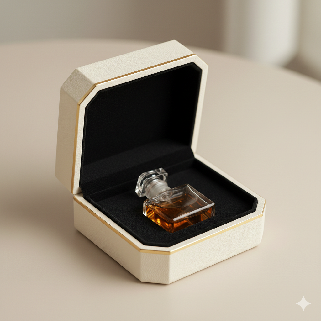
1. The Architecture of Proportion: Why "Small" is a Strategic Choice
The primary error in designing for this category is the conflation of "gift box" with "storage container." When a brand applies the structural logic of a mass-market, large-format storage box to a delicate perfume or jewelry item, it triggers immediate cognitive dissonance. The consumer perceives a ratio imbalance: the package feels "too big" or "clunky" for the precious item inside, subconsciously signaling a lower value.
True French aesthetic packaging relies on precise, compact dimensions that frame the product rather than overwhelm it. This is why standard off-the-shelf sizes often result in a "vulgar" appearance. For brands attempting to navigate this, relying on Luxury Rigid Boxes for Perfume & Jewelry allows for the specific structural constraints required to maintain a petite, balanced form factor. By utilizing rigid, high-density paperboard rather than thin corrugated cardboard, one achieves a slim profile that feels solid and deliberate, not flimsy or over-engineered. The "shell" must disappear, allowing the product to occupy the primary visual space.
Defensive Contrast: A box with sharp, 90-degree angles and excessive height screams "industrial utility." In a domestic setting—on a bedroom vanity or a bathroom counter—this design language is intrusive. It fights with the interior environment. Conversely, a rounded-edge design, reminiscent of classic French architectural motifs, acts as a visual accessory, blending into the user's living space rather than clashing with it.

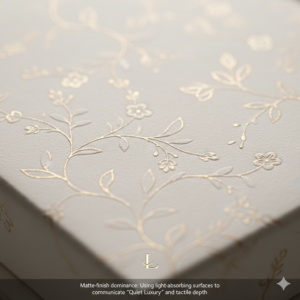
2. Tactility as Credibility: The Surface Psychology
The consumer’s hand is the first critic. When the fingers trace the surface of a box, the brain makes a split-second assessment of quality.
Mass-market designs often utilize high-gloss finishes, which, from a semiotic standpoint, suggest artificiality and reflection—a cheap tactic to mask poor base material. In the French 轻奢 (light luxury) aesthetic, the surface must be matte. Matte finishes are an invitation to touch; they absorb light rather than reflecting it, creating a "soft" sensation that primes the user for a refined unboxing experience. According to principles of visual perception in color science, matte finishes reduce specular reflection, which is often associated with lower-quality plastics or cheap coatings (Ref: The Munsell Color System applications in surface finish).
This is where Precision Finishing & Custom Craftsmanship becomes the critical differentiator. The choice of the substrate—be it premium art paper or tactile, skin-like paper—is the difference between a product that is "bought" and one that is "treasured." When we implement custom embossing or subtle plant-based dark patterns, we are not just adding decoration; we are creating a narrative of craft. A deep, clear debossed logo or pattern signals an investment in tooling, which the user unconsciously translates into an investment in product quality.
The Environmental Interference Test: Consider how these finishes hold up in a real-world environment. High-gloss finishes show fingerprints and scratches within days. Matte, high-quality paper, when treated with the correct protective sealants, retains its integrity. It does not look "worn" after being handled; it looks "well-maintained."
3. The Semiotics of the "Hidden": Engineering as Experience
The most egregious design failure in modern luxury is the exposed metal latch. From a semiotic perspective, a visible metallic buckle, lock, or hinge is a "tool." It signals that the box is a machine for holding items, not a vessel for an experience. It disrupts the purity of the French minimalist aesthetic.
The French standard demands invisibility. The use of internal, concealed magnetics allows for a seamless, continuous flow of material. When the box closes with a satisfying, muffled "thud"—a result of precise magnet placement and air-cushioned tolerances—it communicates a specific psychological state: safety.
- The Psychological Trigger: The "invisible" closure mimics the behavior of high-end, bespoke furnishings. It implies that the item inside is so precious that it must be protected by "magic" (hidden technology) rather than "mechanics" (obvious latches).
- The Cushioning Imperative: A rigid box without a specialized interior liner is an empty promise. If a piece of jewelry rattles or a perfume bottle slides, the entire luxury illusion collapses. The interior must act as a custom-fitted chassis. Using velvet or foam-backed suede liners does more than prevent vibration; it provides a "warm" tactile contrast to the cool, rigid exterior. This internal environment is the final layer of defense against perceived "roughness."
4. The Authority of Production: Why Trust is a Material Fact
Design is not solely visual; it is also ethical. In the current market, the "unboxing experience" is often ruined by the subconscious realization that the packaging smells of toxic adhesives or feels chemically unstable. This is where ISO-Certified Packaging Solutions function as the bedrock of the brand identity.
When a brand invests in high-end perfume or jewelry, the consumer subconsciously demands a container that adheres to professional manufacturing standards. An ISO-certified production process (such as adhering to ISO 9001:2015 Quality Management Systems) guarantees that the materials—the glues, the dyes, the paper fibers—are stable and non-reactive. For a luxury perfume brand, this is critical; chemical off-gassing from poor-quality packaging can alter the olfactory notes of the perfume itself.
By grounding the design in certified, high-standard manufacturing, the brand creates a "safety halo." This is not something the consumer explicitly notices, but it is a deficiency they would notice immediately if it were missing. The "cheap" feel is often a result of volatile organic compounds (VOCs) and poor lamination processes that create air bubbles or surface warping over time. A design that is visually stunning but structurally unstable fails the test of time, and in the luxury segment, durability is the ultimate form of sustainable elegance.
5. Conclusion: Synthesizing the French Aesthetic
The French fragrance and jewelry packaging standard is a rejection of noise. It is a calculated, semiotic strategy that prioritizes:
- Haptic Purity: Replacing glossy, reflective surfaces with tactile, matte, light-absorbing finishes.
- Structural Minimalism: Replacing visible, clunky hardware with hidden, engineered closures.
- Proportional Harmony: Replacing "storage-size" boxes with bespoke, product-hugging forms.
- Invisible Quality: Replacing chemically reactive, mass-produced materials with certified, stable, and protective substrates.
For the designer and the brand strategist, the objective is not to "decorate" the box, but to construct a silence that allows the product to speak. When every element—from the curvature of the corners to the tension of the magnetic closure—is perfectly calibrated, the box ceases to be a container and becomes an extension of the brand's heritage. This is the difference between a box that holds a product, and a box that enshrines it.